
Table of Contents
Let’s be honest—figuring out what’s actually happening on your website can feel like guesswork. You can stare at bounce rates and traffic numbers all day, but they don’t always tell the full story.
That’s where website heatmaps come in.
They show you—literally—what people are doing on your site. Where they click. How far they scroll. What they look at. And just as importantly, what they don’t.
Think of website heatmaps like a behind-the-scenes peek into your users’ behavior. No confusing data, no assumptions—just visual proof of how your website performs in real life.
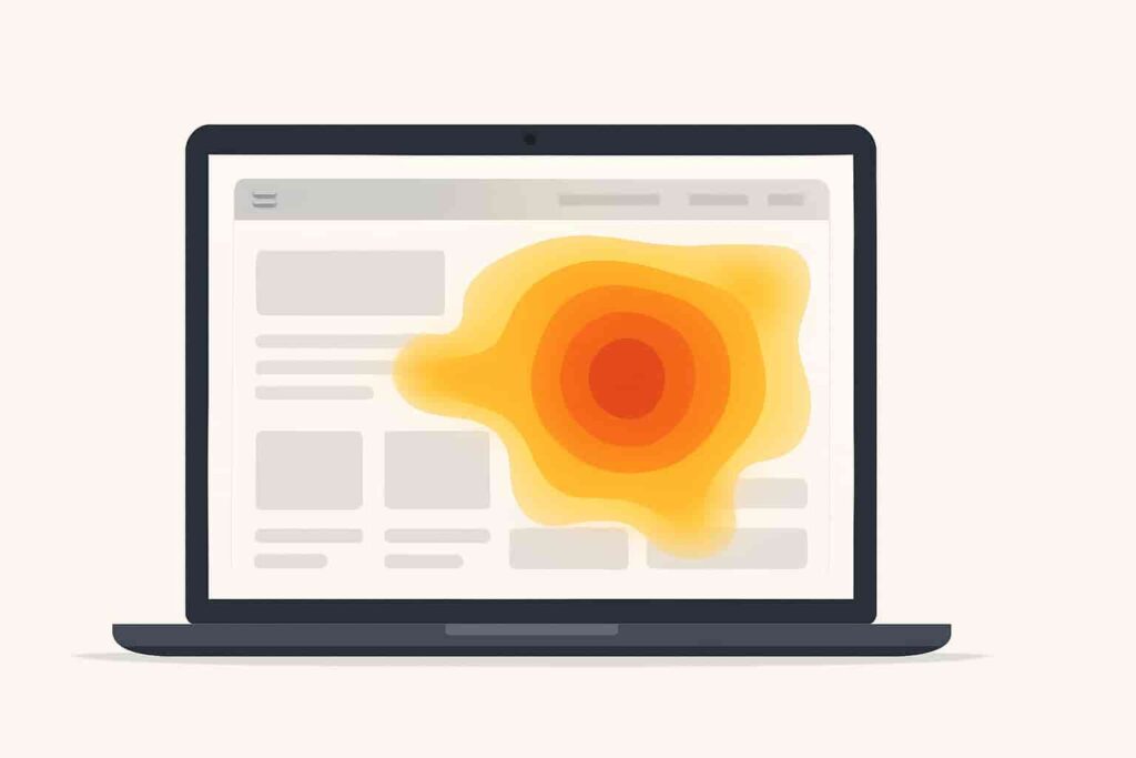
So, What Exactly Are Website Heatmaps?
A website heatmap visually shows where users engage most, using colors like red and blue to highlight hot and cold spots on your site.
- Red and orange = high activity (hot zones)
- Blue or green = low activity (cold zones)
You’re basically seeing your site through your visitor’s eyes. Where they click, how far they scroll, what catches their attention—it’s all laid out visually, so you can finally stop guessing.
Why Website Heatmaps Are Worth Your Time
Here’s the truth: analytics are great, but they can only tell you what is happening. Website heatmaps go a step further and help you understand the why.
Here’s what makes them so useful:
- Spot areas where users are getting stuck or confused
- See which content actually gets attention
- Find out if your call-to-action buttons are being ignored
- Learn how people interact on mobile vs. desktop
- Make smarter, faster changes to boost results
Once you’ve seen how helpful website heatmaps can be, you’ll wonder how you ever ran a website without them.
The Main Types of Website Heatmaps (And What They Show You)
Let’s break down the different types of heatmaps so you know what to look for.
1. Click Heatmaps
These show you where people are clicking (or tapping, on mobile). Are they clicking the right buttons? Are they clicking on something that isn’t even clickable (like a picture)? This tells you what’s working—and what’s not.
2. Scroll Heatmaps
These maps show how far people scroll down your page. If your heatmap fades to blue halfway down, it means most people never even make it to the bottom. So if your “Buy Now” button is buried down there… yeah, that’s a problem.
3. Hover or Movement Heatmaps
These show where users move their mouse or hover on the page. It’s not a perfect representation of eye movement, but it’s a solid clue about what they’re focusing on—especially for desktop users.
4. Confetti Maps
These go a little deeper, showing individual clicks in detail. You can break it down by traffic source, device, or browser and get really specific insights. Think of them as zoomed-in website heatmaps.
How to Actually Use Website Heatmaps
Once you’ve installed a tool (more on that below), it’s time to look at the data.
Here’s what to watch out for:
- Are people clicking things that aren’t clickable? That usually means your layout is confusing.
- Is your call-to-action in a cold zone? Time to move it up or redesign it.
- Is no one scrolling far enough to see key info? Rethink your page structure.
With website heatmaps, you don’t need to guess what’s wrong—you can see it in front of you. Then make a change, and use another heatmap to confirm whether it worked. Easy.
Real-Life Examples That Prove Heatmaps Work
This stuff isn’t just theory—it works. Here are a few examples:
A Product Page That Wasn’t Converting
An online store had a beautiful product page, but very few people were clicking “Add to Cart.” The heatmap showed users focused on the product image, missing the button placed too low on the page. They moved it up, and conversions increased by 27%.
A Blog With High Bounce Rates
A content site noticed people were landing on their blog posts and leaving quickly. A scroll heatmap showed that only 30% of readers were making it past the first paragraph. They rewrote the intro and added images higher up—and average time on page doubled.
A Landing Page With Too Much Going On
A startup was running ads to a landing page with lots of bells and whistles. Their click heatmap showed visitors were distracted—clicking all over the place but not on the signup form. They simplified the layout, removed distractions, and boosted signups by 40%.
Tools That Make Heatmaps Easy
No tech skills needed—these beginner-friendly website heatmap tools make it easy to get started:
- Hotjar – Probably the most popular. Easy to use and has free options.
- Microsoft Clarity – Totally free and surprisingly powerful.
- Crazy Egg – Offers click, scroll, and confetti heatmaps with A/B testing.
- Lucky Orange – Great for combining heatmaps with live chat and surveys.
- Smartlook – Ideal for websites and mobile apps alike.
Pick one, sign up, and add the tracking code to your site. Most tools will start showing results within a few hours.
When Should You Use Website Heatmaps?
Honestly? Almost anytime.
- Launching a new landing page? Use a heatmap.
- Not sure why people aren’t clicking your offer? Use a heatmap.
- Redesigning your homepage? Use a heatmap.
- Wondering if your content is engaging? You get the idea.
Website heatmaps are one of the few tools that are useful at every stage of the website journey.
Tips for Getting the Most Out of Website Heatmaps
A few key tips to remember:
- Start with high-traffic pages – That’s where you’ll see the biggest impact.
- Compare mobile and desktop behavior – They’re often very different.
- Don’t obsess over every single click – Look for clear patterns.
- Use heatmaps regularly – Don’t treat them as one-time fixes.
- Combine with other tools – Like session recordings or A/B tests.
Final Thoughts: Stop Guessing. Start Watching.
At the end of the day, your website should work for your visitors—not just look pretty to you. And the best way to know if it’s doing its job? Watch how people actually use it.
That’s exactly what website heatmaps let you do.
They show you what’s working, what’s not, and what to fix next—without needing to dig through complicated reports.
So if you’re tired of making changes based on gut feelings or “best practices” that don’t deliver, start using website heatmaps.
Because when you can see what your visitors are doing, you can finally give them what they need.